Contractor Backed Picture Frame Two Tone Deck Colors for Homeowners
Contractor-backed two tone deck color pairings and picture-frame ideas, plus a builder-ready testing and execution checklist and maintenance tips for...
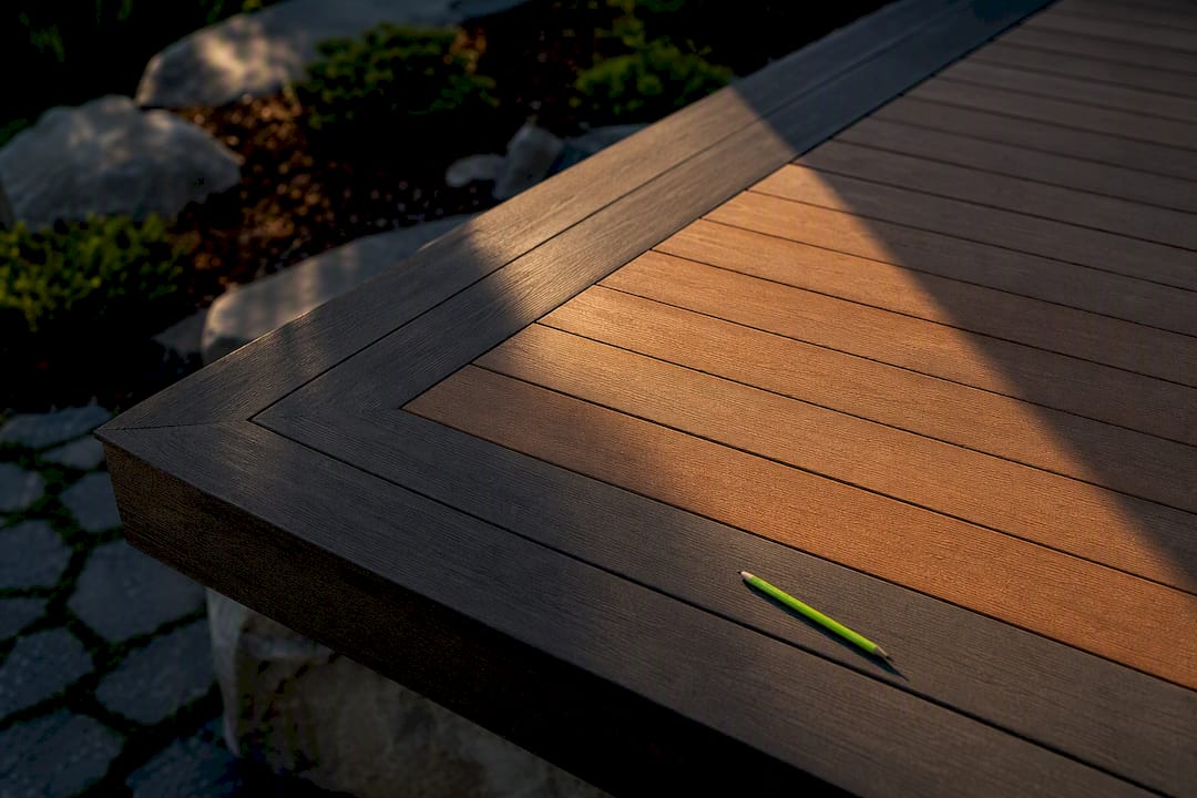
Contractor Backed Picture Frame Two Tone Deck Colors for Homeowners
The most reliable two tone deck colors combination is a darker border or railing framing a lighter or mid-tone field. It hides cut ends, adds visual weight where the eye needs it, and works across ranch homes and two-story colonials alike. Photograph your house exterior, identify whether its trim leans warm or cool, then order two or three sample boards before you commit to anything. Some decking companies walk homeowners through this process during design consultations.
TL;DR:
A darker border or railing framing a lighter deck field hides cut ends and adds visual weight, especially on larger decks over 300 square feet.
Coordinated color lines from manufacturers simplify matching border and field shades, with popular schemes including warm wood tones with espresso borders or greige with charcoal railing.
The picture-frame border is the most common pattern, with double or accent stripes requiring higher skill levels and precise framing before decking begins.
Choosing the right colors depends on your house’s undertones, deck size, and sun exposure, with mid-tone or greige options best hiding dirt and wear.
Semi-transparent stains soften borders but are harder to keep sharp, while composite and PVC hold colors permanently and require less upkeep over time.
CactusdeckingBuild a Deck That Fits Your HomeCactus Decking creates custom outdoor living spaces with tailored materials, in-house craftsmanship, and warranty-backed installations in Everett.Explore Cactus Decking
Table of Contents
Two Tone Deck Color Combinations Worth Copying
Layout Patterns: Borders, Inlays, and Zoning
How to Choose Colors That Actually Fit Your House
Stains, Paint, and Composite: How Finish Changes the Color Story
Keeping Two Tone Decks Looking Sharp Over Time
Testing and Execution Checklist Before You Commit
What Actually Sells Homeowners on Two Tone Decks
Let Cactus Decking Bring Your Two Tone Design to Life
Sources
Two Tone Deck Color Combinations Worth Copying
Not every pairing suits every house. Here’s what actually works, grouped by the look you’re going for.
Warm wood field, espresso border. Golden cedar or honey-toned composite decking with a dark walnut or espresso picture-frame border. Works on craftsman and traditional homes; a single-board frame keeps it subtle, a two-board frame reads bolder on decks that are visually larger.
Driftwood greige field, charcoal rail. A weathered gray-brown field paired with black or charcoal aluminum railing. This is the current default for modern-neutral exteriors, though a greige-only deck can feel cold without a warm accent like a cedar bench or planter box.
Charcoal field, light oak border. Flip the usual formula: dark decking with a lighter contrast frame. Dramatic on contemporary builds with black window frames, but it shows dust and pollen faster than mid-tones.
Garden green-black. Deep forest or hunter green fascia against black composite decking, popular on decks that back onto landscaping. Scale matters here; keep the green to trim and stair risers on smaller footprints so it doesn’t overwhelm.
Coastal light neutrals. Warm gray or sandstone field with white or driftwood-white rail caps. Stays cooler underfoot in full sun and suits Pacific Northwest homes with light siding.
If you’re working with composite or PVC, most manufacturers now ship coordinated color lines built for exactly this kind of pairing, which takes the guesswork out of matching a field color to a border or rail shade. For more combinations mapped to specific house styles, the deck color ideas guide breaks down which families pair best with brick, siding, and stone.
Layout Patterns: Borders, Inlays, and Zoning
The picture-frame border is the workhorse pattern. A single-board frame in a darker tone reads clean and subtle; go two boards wide on decks over 300 square feet or the frame disappears visually. Fascia and stair risers should match the border color, not the field, or the transition looks unfinished.
Picture-frame border — one contrasting board around the perimeter, mitered at corners. Moderate difficulty; requires accurate blocking underneath.
Double border or breaker boards — a secondary stripe set a few feet inside the frame, often used to break up long runs of decking. Higher skill requirement for consistent spacing.
Single accent stripe — one contrast row marking a transition, like where a dining area meets a lounge zone. Easiest DIY-friendly option.
Geometric inlays — diamond or herringbone patterns using both tones. Labor-intensive, best left to a pro crew comfortable with compound miters.
Level-to-level zoning — shifting tone between deck levels, covered in more depth in multi-level deck design.
Mitered corners on a frame need continuous support underneath, not a retrofit block nailed in after the fact. That’s a framing-stage decision.
Pro Tip: Tell your framer about the two-tone plan before decking day. Blocking placed under borders and breaker boards during framing saves a costly retrofit and keeps mitered corners from sagging over time.
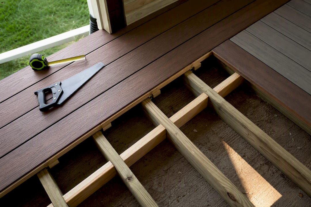
Simple picture frames are within reach for a confident DIYer. Multi-level zoning, herringbone inlays, and anything with compound miters is where hiring a crew earns its cost.
How to Choose Colors That Actually Fit Your House
Start with a photo of your house in daylight, not under porch lighting. Identify whether the siding, brick, or stone leans warm (yellow, red, brown undertones) or cool (blue, gray undertones), because a field color with the wrong undertone will clash even if the two colors look fine on paint chips.
From there, pick one of three strategies:
Blend — field color close to the house tone, contrast reserved for the rail or border only.
Contrast — field and border sit noticeably apart on the color wheel, best on larger decks where there’s enough surface to carry the difference.
Highlight — a small accent, like a single stripe or stair tread color, used sparingly on smaller footprints.
Deck size changes the math. A small deck with heavy contrast can look busy; a large deck in one flat tone can look unfinished. Mid-tone woods and greige tones are the safest bet for hiding everyday dust, pollen, and foot traffic that show up fast on very dark or very light boards.
Sun exposure matters too. Darker colors absorb more heat and can get uncomfortably warm underfoot on a bright afternoon, while very light colors show water spots, grill grease, and glare more readily. There’s no fixed rule that a deck has to be lighter or darker than the house. It comes down to how much heat and glare your site actually gets.
Stains, Paint, and Composite: How Finish Changes the Color Story
The finish system you pick determines how crisp your two-tone border looks and how much upkeep it demands.
Semi-transparent stain lets wood grain show through and ages gracefully, but color shifts slightly with each recoat, making sharp borders harder to keep consistent over the years.
Solid stain or paint gives you the cleanest, most consistent border line, since it behaves more like a coating than a wood-toned wash.
Composite and PVC decking hold color permanently with no recoating, and manufacturers’ coordinated palettes make matching a border to a field close to foolproof.
For crisp lines, painted railings, solid-stain borders, and composite coordinate colors all outperform semi-transparent stain on definition. One ordering note that trips up a lot of homeowners: order your accent color and field color from the same production run, and add 10 to 15% extra material on the accent color to cover mitered waste. Composite manufacturers built their matched-line systems specifically to reduce that kind of waste and mismatch risk.
Keeping Two Tone Decks Looking Sharp Over Time
Color choice drives how often you’ll be out there cleaning. Dark tones hide dirt but show dust and pollen film; very light tones show every water stain and grease drip. Mid-tone wood and greige stay looking clean the longest between washes.
Rinse and sweep monthly during pollen season; a mild deck cleaner and soft brush handle most seasonal grime.
Semi-transparent stains typically need recoating every 2 to 3 years; solid stain and paint stretch closer to 4 to 5 years; composite and PVC need no recoating at all.
Dark composite boards expand more in direct heat, so gapping specs matter more on charcoal and black fields than on lighter colors.
Pro Tip: If you love a dark border but worry about heat and glare, keep the dark tone to the rail and border only, and let the field stay mid-tone. You get the contrast without the whole deck heating up.
Testing and Execution Checklist Before You Commit
Sample boards lie under artificial light. Test them outside.
Place 2 to 3 sample boards where the deck will actually sit, and view them at morning, midday, and dusk light.
Check both colors from standing height and from a seated porch chair angle, since undertones shift with viewing angle.
Order field and accent colors from the same production run and add extra bundles for the accent to cover mitered corners.
Confirm with your installer that blocking sits under every border and breaker board before decking goes down.
Ask your installer how they handle hidden fasteners and mitered corners on two-tone runs, since that’s where amateur installs usually show seams.
What Actually Sells Homeowners on Two Tone Decks
Most homeowners land on the same combo for the same reason: a darker border makes a deck look intentional, not just installed. It’s the cheapest design move that reads as custom work.
The process can include photos and inspiration boards, physical sample boards on-site, and finishing with a crew building it under a warranty. One recent project swapped a flat single-tone deck for a picture-frame layout in two matched composite tones, and the difference in curb appeal from the street was immediate.
— Vlad
Let Cactus Decking Bring Your Two Tone Design to Life
A DIY color chip and a matched composite border look nothing alike once boards are actually cut, mitered, and blocked correctly. Professional deck builders can handle the part that’s hard to get right at home: picking colors that suit your house’s undertones, placing real sample boards on your actual deck, and building borders and inlays with a crew that plans blocking before the first board goes down, often backed by a warranty on the finished work.
Bring photos of your house, a few color combinations you’re drawn to, and a rough budget range to your first deck design consultation. From there, expect a site visit and a straightforward estimate, no guessing games. Browse the deck gallery for real two-tone projects before you go in, so you walk into that first conversation already knowing what you like. If you’re also weighing shade or weather protection alongside color, ask about deck covers during the same visit.
Sources
For manufacturer-level detail on coordinated composite palettes and border techniques, see the Trex two-tone design guide. For house-to-deck color matching principles, The Spruce’s guide covers the tradeoffs well. Current neutral palette trends in home finishes are covered in this interior design trends roundup.
FAQ
Should your deck be lighter or darker than your house?
There’s no fixed rule; choose lighter to cut down on surface heat in strong sun, or darker for stronger contrast and less visible dirt between cleanings.
What are the trendy deck paint colors for 2026?
Driftwood greige fields paired with charcoal or black rail hardware remain the leading modern-neutral combination, often warmed up with a cedar accent to avoid feeling sterile.
What is the most popular deck color this year?
Mid-tone wood and greige tones lead because they hide everyday dust, pollen, and wear better than very dark or very light finishes.
What are some creative ideas for a two-tone composite deck?
Try a picture-frame border in a contrasting composite tone, a single accent stripe marking a dining-to-lounge transition, or a color shift between deck levels; Cactus Decking can walk you through which pattern fits your layout during a design consultation.
Does a dark deck border cost more to install?
Material cost only rises modestly for the extra color bundle, but labor increases somewhat for the added blocking and mitered corners a clean border requires.